OVERVIEW
1. We are not touching the current, live site. We are designing and coding a MOBILE-ONLY site. (For now.) Once this is functioning at 100%, we will migrate the look and feel (and any “new content” to the desktop site.)
2. Color palette you see here has been rejected. The main color palette is to be re-worked.
3. At this point, we are working on html code (FROM SCRATCH). The main focus is on:
- OVER-ALL DESIGN,
- EASE-OF-USE, and
- FUNCTIONALITY
After the design and content are approved, the next hurdle is to integrate the content with Jordan’s code/functionality. This is a major coding step that will require much testing and testing and testing… all in a “sand-box” (off-line).
4. CSS styling throughout. Easily editable and an over-arching design principle throughout entire site.
5. Pricing. Do you have a budget in mind? Would you prefer to have a monthly contract? What are your monthly expectations? Please let me know what works for you.
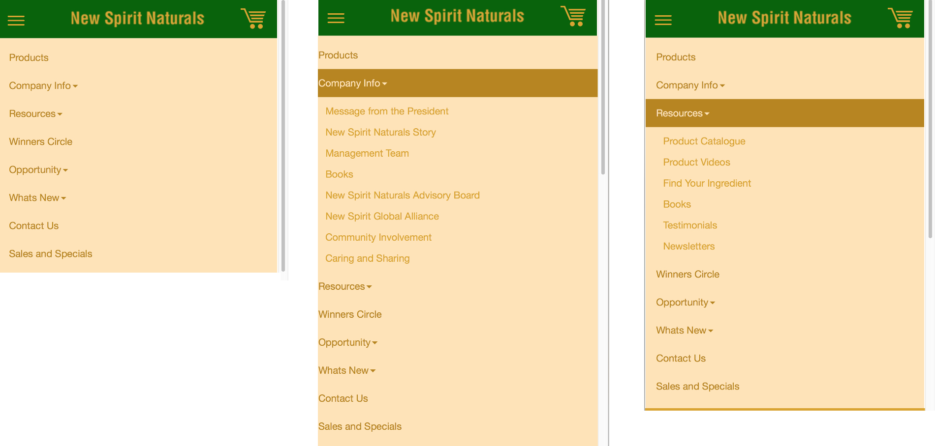
MAIN DROP DOWN MENUS
1. Note the + signs that indicate additional content.
2. See the manner in which additional content is displayed.
3. Large and easily click-able.
4. Three samples shown side-by-side.
5. Upper left: Clickable button that opens up the navigation drop down menus.
6. Upper right: Shopping cart will display number of items already added to the cart.
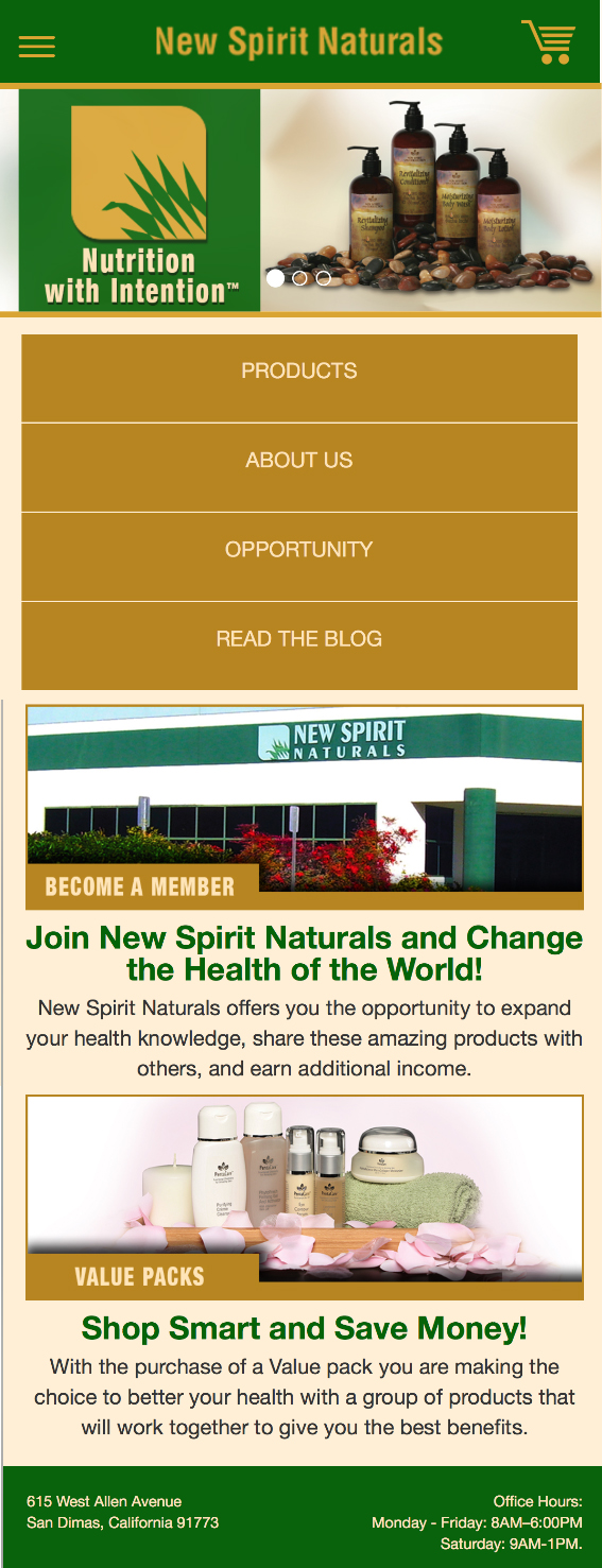
HOME PAGE
1. Carousel of rotating images that includes large New Spirit logo-symbol.
2. Large and easily click-able buttons of most important content.
3. Visuals that add interest and text that adds information, easily clickable. There is no limit to the amount of content we can add here.
4. Footer content to be determined. Most likely on every page.
PRODUCT PAGE
MAIN CONTENT
1. Note that although only sample content is displayed here, every main page of the printed catalog will have a main header.
2. No clicking. All content is accessed via practical, intuitive scrolling with the flick of a thumb.
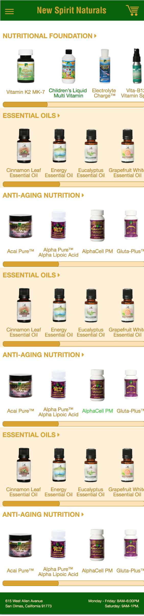
LEFT-RIGHT SCROLL
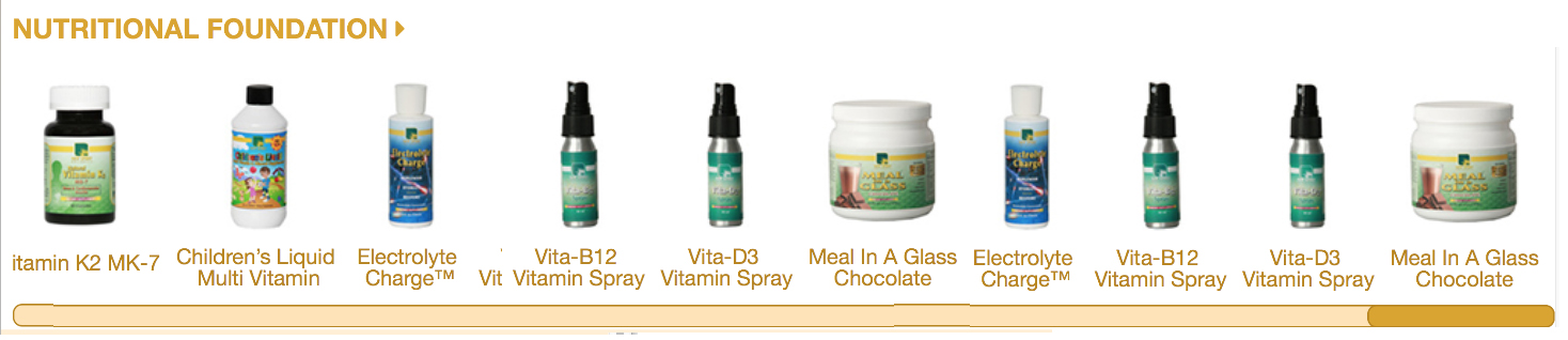
HORIZONTAL-SCROLL PER TOPIC
1. This concept is rather difficult to show in snap-shot format. Know that all the product images are the same size as in the image shown immediately above.
2. ON THE PHONE, the horizontal-scroll bar does not display. The user intuitively “thumb-scrolls” to the right, then chooses their product. (Amazon.com uses this horizontal-scroll model.)
Product Info
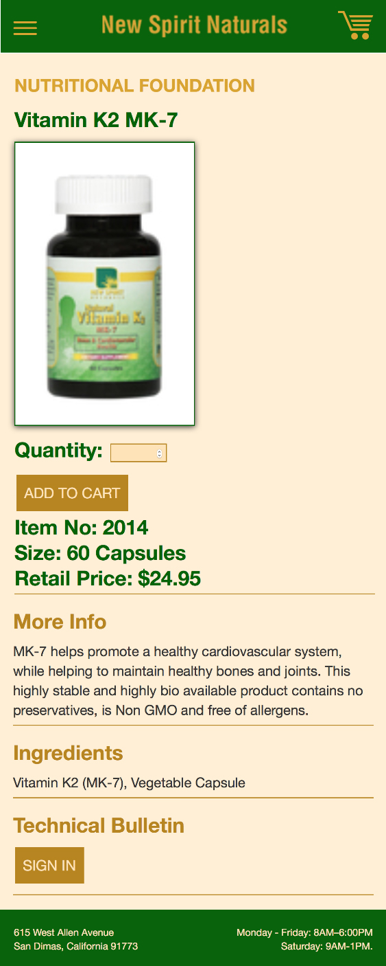
SAMPLE 1
1. Content directly from current site.
2. “QUANTITY”: Large. Easily fill-able.
3. “ADD TO CART”: Large. Easily click-able.
4. ALL information for this product is listed on this page. No clicking.
5. “TECHNICAL BULLETIN” requires password.
PRODUCT INFO
SAMPLE 2
1. More content than “Product Info Sample 1.”
2. “QUANTITY”: Large. Easily fill-able.
3. “ADD TO CART”: Large. Easily click-able.
4. ALL information for this product is listed here. No clicking.
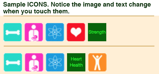
5. Colorful ICONS above the “More Info” text. ON THE PHONE: As you touch these ICONS, the image changes to explanatory text.
6. “TECHNICAL BULLETIN” requires password.

ICONS
SHOPPING CART
1. Standard “Cart" data gathered and displayed here.
2. Number of steps in the "Check-Out Process" prominently on display.
3. “Questions and Other Customer Service FAQs immediately accessible here.

WHAT’S NEXT?
1. Create “Company” pages.
2. Create “Blog” look-and-feel.
3. Create “Winners Circle” look and feel.